
ROC curves and Area Under the Curve explained (video)
While competing in a Kaggle competition this summer, I came across a simple visualization (created by a fellow competitor) that helped me to gain a better intuitive understanding of ROC curves and Area Under the Curve (AUC). I created a video explaining this visualization to serve as a learning aid for my data science students, and decided to share it publicly to help others understand this complex topic.
An ROC curve is the most commonly used way to visualize the performance of a binary classifier, and AUC is (arguably) the best way to summarize its performance in a single number. As such, gaining a deep understanding of ROC curves and AUC is beneficial for data scientists, machine learning practitioners, and medical researchers (among others).
The 14-minute video is embedded below, followed by the complete transcript (including graphics). If you want to skip to a particular section in the video, simply click one of the time codes listed in the transcript (such as 0:52).
I welcome your feedback and questions in the comments section!
Video Transcript
(0:00) This video should help you to gain an intuitive understanding of ROC curves and Area Under the Curve, also known as AUC.
An ROC curve is a commonly used way to visualize the performance of a binary classifier, meaning a classifier with two possible output classes.
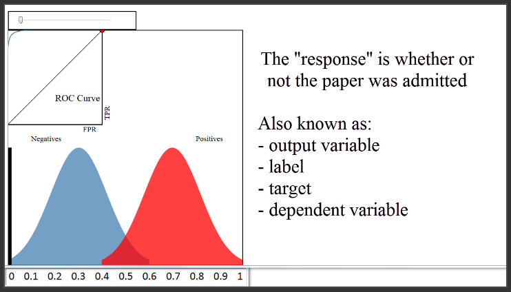
For example, let's pretend you built a classifier to predict whether a research paper will be admitted to a journal, based on a variety of factors. The features might be the length of the paper, the number of authors, the number of papers those authors have previously submitted to the journal, et cetera. The response (or "output variable") would be whether or not the paper was admitted.
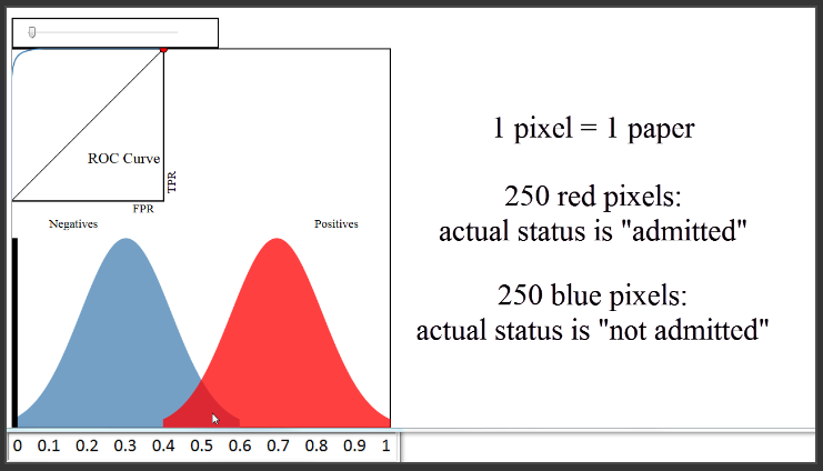
(0:52) Let's first take a look at the bottom portion of this diagram, and ignore the everything except the blue and red distributions. We'll pretend that every blue and red pixel represents a paper for which you want to predict the admission status. This is your validation (or "hold-out") set, so you know the true admission status of each paper. The 250 red pixels are the papers that were actually admitted, and the 250 blue pixels are the papers that were not admitted.
(1:32) Since this is your validation set, you want to judge how well your model is doing by comparing your model's predictions to the true admission statuses of those 500 papers. We'll assume that you used a classification method such as logistic regression that can not only make a prediction for each paper, but can also output a predicted probability of admission for each paper. These blue and red distributions are one way to visualize how those predicted probabilities compare to the true statuses.
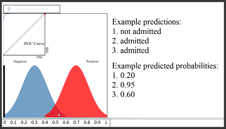
(2:08) Let's examine this plot in detail. The x-axis represents your predicted probabilities, and the y-axis represents a count of observations, kind of like a histogram. Let's estimate that the height at 0.1 is 10 pixels. This plot tells you that there were 10 papers for which you predicted an admission probability of 0.1, and the true status for all 10 papers was negative (meaning not admitted). There were about 50 papers for which you predicted an admittance probability of 0.3, and none of those 50 were admitted. There were about 20 papers for which you predicted a probability of 0.5, and half of those were admitted and the other half were not. There were 50 papers for which you predicted a probability of 0.7, and all of those were admitted. And so on.
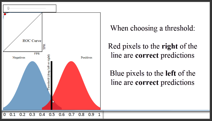
(3:16) Based on this plot, you might say that your classifier is doing quite well, since it did a good job of separating the classes. To actually make your class predictions, you might set your "threshold" at 0.5, and classify everything above 0.5 as admitted and everything below 0.5 as not admitted, which is what most classification methods will do by default. With that threshold, your accuracy rate would be above 90%, which is probably very good.
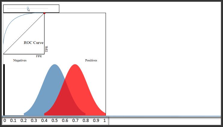
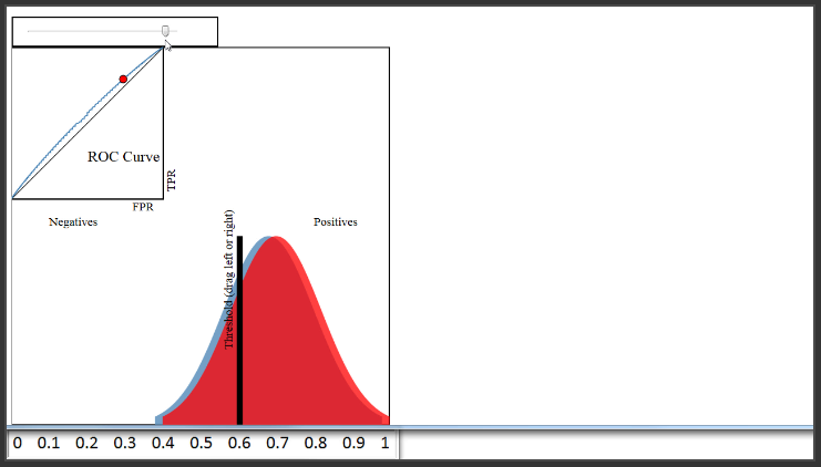
(3:58) Now let's pretend that your classifier didn't do nearly as well and move the blue distribution. You can see that there is a lot more overlap here, and regardless of where you set your threshold, your classification accuracy will be much lower than before.
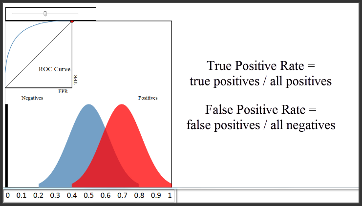
(4:19) Now let's talk about the ROC curve that you see here in the upper left. So, what is an ROC curve? It is a plot of the True Positive Rate (on the y-axis) versus the False Positive Rate (on the x-axis) for every possible classification threshold. As a reminder, the True Positive Rate answers the question, "When the actual classification is positive (meaning admitted), how often does the classfier predict positive?" The False Positive Rate answers the question, "When the actual classification is negative (meaning not admitted), how often does the classifier incorrectly predict positive?" Both the True Positive Rate and the False Positive Rate range from 0 to 1.
(5:15) To see how the ROC curve is actually generated, let's set some example thresholds for classifying a paper as admitted.
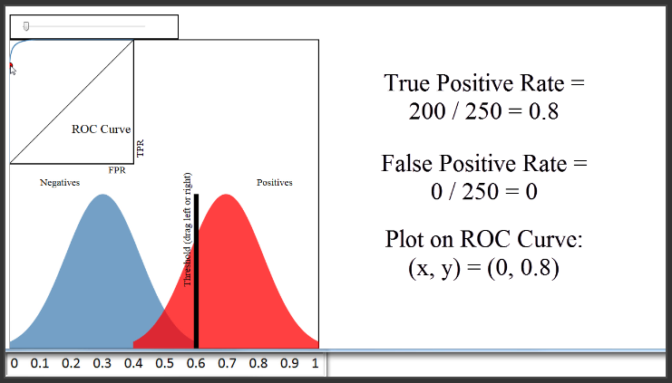
A threshold of 0.8 would classify 50 papers as admitted, and 450 papers as not admitted. The True Positive Rate would be the red pixels to the right of the line divided by all red pixels, or 50 divided by 250, which is 0.2. The False Positive Rate would be the blue pixels to the right of the line divided by all blue pixels, or 0 divided by 250, which is 0. Thus, we would plot a point at 0 on the x-axis, and 0.2 on the y-axis, which is right here.

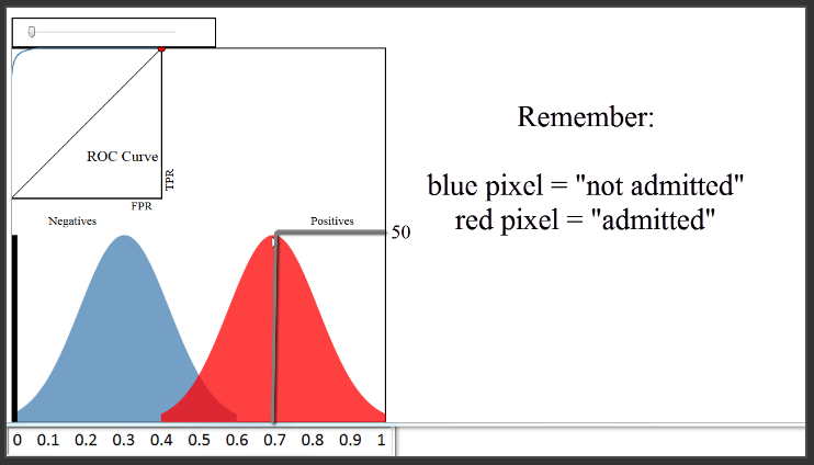
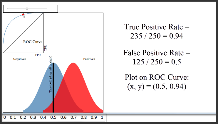
(6:16) Let's set a different threshold of 0.5. That would classify 360 papers as admitted, and 140 papers as not admitted. The True Positive Rate would be 235 divided by 250, or 0.94. The False Positive Rate would be 125 divided by 250, or 0.5. Thus, we would plot a point at 0.5 on the x-axis, and 0.94 on the y-axis, which is right here.
(7:05) We've plotted two points, but to generate the entire ROC curve, all we have to do is to plot the True Positive Rate versus the False Positive Rate for all possible classification thresholds which range from 0 to 1. That is a huge benefit of using an ROC curve to evaluate a classifier instead of a simpler metric such as misclassification rate, in that an ROC curve visualizes all possible classification thresholds, whereas misclassification rate only represents your error rate for a single threshold. Note that you can't actually see the thresholds used to generate the ROC curve anywhere on the curve itself.
Now, let's move the blue distribution back to where it was before. Because the classifier is doing a very good job of separating the blues and the reds, I can set a threshold of 0.6, have a True Positive Rate of 0.8, and still have a False Positive Rate of 0.
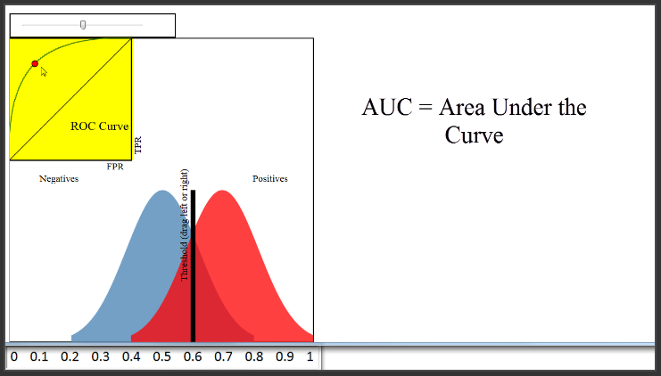
(8:24) Therefore, a classifier that does a very good job separating the classes will have an ROC curve that hugs the upper left corner of the plot. Conversely, a classifier that does a very poor job separating the classes will have an ROC curve that is close to this black diagonal line. That line essentially represents a classifier that does no better than random guessing.
(8:55) Naturally, you might want to use the ROC curve to quantify the performance of a classifier, and give a higher score for this classifier than this classifier. That is the purpose of AUC, which stands for Area Under the Curve. AUC is literally just the percentage of this box that is under this curve. This classifier has an AUC of around 0.8, a very poor classifier has an AUC of around 0.5, and this classifier has an AUC of close to 1.
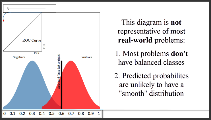
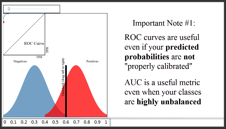
(9:45) There are two things I want to mention about this diagram. First, this diagram shows a case where your classes are perfectly balanced, which is why the size of the blue and the red distributions are identical. In most real-world problems, this is not the case. For example, if only 10% of papers were admitted, the blue distribution would be nine times larger than the red distribution. However, that doesn't change how the ROC curve is generated.
A second note about this diagram is that it shows a case where your predicted probabilities have a very smooth shape, similar to a normal distribution. That was just for demonstration purposes. The probabilities output by your classifier will not necessarily follow any particular shape.
(10:40) To close, I want to add three other important notes. The first note is that the ROC curve and AUC are insensitive to whether your predicted probabilities are properly calibrated to actually represent probabilities of class membership. In other words, the ROC curve and the AUC would be identical even if your predicted probabilities ranged from 0.9 to 1 instead of 0 to 1, as long as the ordering of observations by predicted probability remained the same. All the AUC metric cares about is how well your classifier separated the two classes, and thus it is said to only be sensitive to rank ordering. You can think of AUC as representing the probability that a classifier will rank a randomly chosen positive observation higher than a randomly chosen negative observation, and thus it is a useful metric even for datasets with highly unbalanced classes.
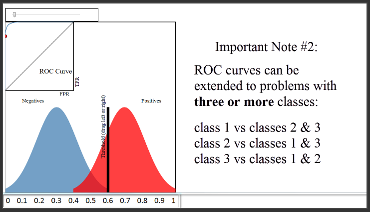
(11:52) The second note is that ROC curves can be extended to classification problems with three or more classes using what is called a "one versus all" approach. That means if you have three classes, you would create three ROC curves. In the first curve, you would choose the first class as the positive class, and group the other two classes together as the negative class. In the second curve, you would choose the second class as the positive class, and group the other two classes together as the negative class. And so on.
(12:30) Finally, you might be wondering how you should set your classification threshold, once you are ready to use it to predict out-of-sample data. That's actually more of a business decision, in that you have to decide whether you would rather minimize your False Positive Rate or maximize your True Positive Rate. In our journal example, it's not obvious what you should do. But let's say your classifier was being used to predict whether a given credit card transaction might be fraudulent and thus should be reviewed by the credit card holder. The business decision might be to set the threshold very low. That will result in a lot of false positives, but that might be considered acceptable because it would maximize the true positive rate and thus minimize the number of cases in which a real instance of fraud was not flagged for review.
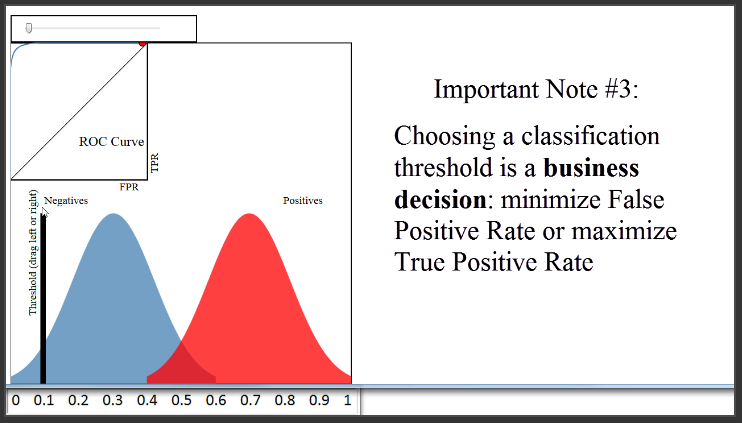
(13:34) In the end, you will always have to choose a classification threshold, but the ROC curve will help you to visually understand the impact of that choice.
Thanks very much to Navan for creating this excellent vizualization. Below this video, I've linked to it as well as a very readable paper that provides a much more in-depth treatment of ROC curves. I also welcome your questions in the comments.